Print

29 January 2017

You're my person, Flutterby Designs

Hi there, Ros here today to share a layout that I have created using the Mad About You collection.


After slapping down a few colours of paint I have used the Hugs and Kisses stencil with some moulding paste.  You can see that I have done this under where my photo cluster is sitting and also on the opposite side of the page.  This give my layout some balance.
I also added a few splashes of black Flutter Colour to the background.


I was a little stuck at first with this collection cause I don't have a person.  It didn't take long to realise that it really doesn't matter.  This collection is perfect for any of my loves.

For my cluster I have cut some of the filler cards into different sizes and layered them together.  Along the edge of this is some of the gorgeous little Page Tabs.  My photo is sitting inside the gorgeous Mad About You frame.


I have also cut some of the filler cards into some little banners to poke into the photo stack.  This has then been finished off this a super cute flair button.


Right at the bottom of the layout I have matted the words cut from one of the filler cards onto some more little banners.


Hope you've been inspired ♥


post signature

12 January 2017

Hi everyone!!
It's my first share for Flutterby Designs.
If I said I was excited to be part of the Flutterby team, it would be a huge understatement. I'm so excited to be part of this team that I ended up creating 6 projects to share.  I got a little carried away, but once I started I couldn't stop.

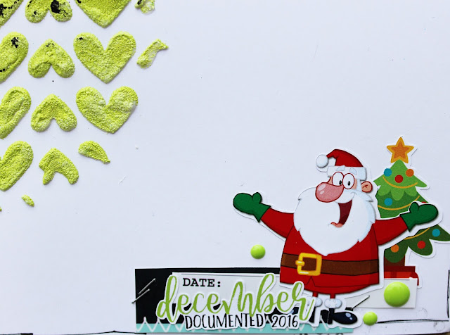
For my first share I decided to show you a couple of Christmas pages I created using the Dec Documented 2016 range.


My page began with one of my fave techniques.  I laid down some moulding paste with the Stargazed stencil.  After this I sprinkled embossing powder over top and heat dried.  This gives the moulding paste a puffy enamel look. It's also an awesome way of getting colour on your background without any water.


For my photo stack I have taken various elements from the Everday Etc Cards and layered them.  I used one of my favourite punches to add  a different visual to one of the cards, and popped a Page Tab in amongst the layers.


The little santa hat is from the Sticky Quotes, and by adding a little snip with my scissors I have been able to have the hat sitting behind my photo with the pom pom hanging over the front.


Some words from the Sticky Quotes have been used here.  They've been cut into separate words and outlined with white gel pen.  The little heart has been taken from one of the Everyday Etc cards.  My layout has been finished off with a Christmas Tree wood veneer, painted to match the cards and a Flair Button.


I started my second page with the same background technique.  This time I used the I {heart} You stencil with embossing powder.


I always make my little photo stacks as a separate embellishment to my page.  This way I can change them around, add more to the background or change whereabouts on my page I want it to sit.  


Once I had all my layers cut out and stacked up here, I felt that the photo was disappearing a little on the page.  To solve this I've taken some Black Mayhem Flutter Colour Paint and swiped it across the background with an old rewards card.

It definitely did the trick and the photo cluster is now popping off the page.


My page has been finished off with a few Enamel Dots and a Flair Button.


Thanks heaps for visiting my first share.  Hope you've been inspired ♥ 


post signature

06 January 2017

Kraft +, On your bike

Challenge time again at Kraft +
Fab mood board, on your bike.

http://kraftpluschallenges.blogspot.com.au/
 

OMG! See that You Rock title,
I got it at Flutterby Designs and totally love it.


So many awesome sponsors again this month.

Pop over to the Kraft+ blog and check out the other
DT work.  Fingers crossed you can join us this month.
post signature